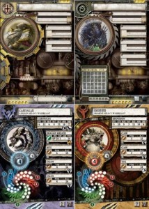
MkII Hordes Cards’ Improved Aesthetics
The Hordes MkII cards were previewed a while back but now that I have mine in hand I’m noticing something I glossed over before. The Warmachine MkII cards seemed to receive a negative reaction on the forums, but it looks like PP took some of the feedback and made a change that I much prefer.
Spirals aside, I definitely think that the Hordes cards came out looking better than their Warmachine counterparts. The contributor is the card backgrounds themselves. Where the Warmachine card backgrounds are gear-filled and busy, the Hordes cards have more organic and subtle designs without light-effects. They encourage the eye to look past them instead of jarring the eye to stare at them like the Warmachine cards do. The cards just feel less busy overall, and as a result also feel more spacious and less cluttered.
The spiral issues is just a personal gripe of mine that isn’t going to change one way or the other. Spirals aren’t going to change (unfortunately) so it’s just something I have to accept. Although I will say the MkII Spirals are definitely better than their MkI counterparts. The spirals are larger and each aspect has a different colored background, making it easier to follow them around the spiral.
So overall the MkII Hordes cards are definitely a step in the right direction. There are a few areas of design that could be improved but overall it will definitely service for the next couple years.
